OCASI Client Management System - OCMS
Know how to make good use of the OCMS logo, colours, co-branding, and other other visual identity elements
On this page:
1. Logo composition
The OCASI Client Management System (OCMS) logo and visual branding should meet the needs of your staff, funders, and clients.


Please note that the OCMS brand logo consists of 3 elements:
- the symbol that represents the concepts of cloud and uploading
- the letter-mark “OCMS”, which is composed of the organization’s initials (acronym), without periods after each letter, and all capital letters, and horizontally aligned with the symbol
- the proper name of the product (“OCASI Client Management System”), written in title case, and placed underneath the letter-mark, and vertically aligned to the left with the letter-mark OCMS
There is a logo version for product demos, that consists of:
- the OCMS brand logo
- the word “DEMO” in uppercase, aligned to the right of the brand logo
In instances where the name of the product is not easy to read due to its small size, the letter-mark should go alone.
2. Download logo
OCASI’s brand colour palette consists of one primary core hue (OCMS green) used as a solid colour. The main colour usage is OCMS green combined with white or very light backgrounds and darker grey or black for text.
You can download the OCMS logos from its download section under assets, including low and high resolution files.
3. Colours
OCMS brand colour palette consists of one primary core hue (OCMS green) used as a solid colour. The main colour usage is OCMS green combined with white or very light backgrounds and darker grey or black for text.
Download colour schemes (.txt, .json)
Check accessibility contrast gridCheck contrast triangle (text vs. link vs. background)
Main colours
OCMS green
HEX: #155D44 | CMYK: 87 / 39 / 7 / 33
Sample usage: green backgrounds (footers, aside blocks, covers), coloured headlines
OCMS darker green
HEX: #0E4633 | CMYK: 87 / 45 / 79 / 50
Sample usage: call-to-actions (CTAs), dark topbars, dark footers
Accent blue
HEX: #13768F | CMYK: 87 / 42 / 33 / 6
Sample usage: links, accents, icons
Greys
Black
HEX: #020907 | CMYK: 78 / 0 / 22 / 96
Sample usage: black backgrounds, black text and headlines
Darker grey
HEX: #34423D | CMYK: 80 / 26 / 82 / 11
Sample usage: dark headlines and base text
Dark grey
HEX: #646e6b | CMYK: 80 / 26 / 82 / 11
Sample usage: labels
Grey
HEX: #C0C5C3 | CMYK: 78 / 0 / 22 / 96
Sample usage: light text
Light grey
HEX: #DFE1E0 | CMYK: 78 / 0 / 22 / 96
Sample usage: borders, lines
Lighter grey
HEX: #F9F9F9 | CMYK: 78 / 0 / 22 / 96
Sample usage: light backgrounds (sidebars, blockquotes, callouts), light text on dark backgrounds
White
HEX: #FFFFFF | CMYK: 78 / 0 / 22 / 96
Sample usage: page background
4. Logo usage
The logo on background colours
Do
Do
Do
Do
Do
Do
Don’t
Don’t
Don’t
Don’t
Don’t
Don’t
The colour of the OCMS brand logo is always:
- green, “OCMS green”, used on white or very light grey backgrounds
- black, used on white or very light backgrounds
- white, used on black, dark green, or dark grey backgrounds
- gray, used on white backgrounds for neutral design treatments
Whenever possible, work with the OCMS green logo version on white backgrounds.
The logo on graphical backgrounds
- Make sure the logo has enough contrast with the background
- Do not use the OCMS green logo on top of a photograph, graphic, or gradient background unless it sits on a very light or very dark area of the image
Clear space
To provide appropriate visibility and legibility to the OCMS logo:
- keep a minimum clear space between the logo and other elements around
- use the height of the logo as a guide to determine a minimum clear space
- ideally, you may always leave more than the minimum clear space
Minimum size
Whenever possible, the size of the logo should be larger than the minimum size.
- for print materials, the minimum size is 1.25 cm (about 1/2 in) in height
- on digital screens, the minimum size is 40 pixels in height
🤔 🤔 🤔
As a rule of thumb, do not scale the logo to a point where it does not look good or has poor legibility.
Resizing proportionally
Don’t
Don’t
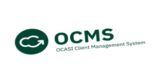
The proportions of the brand logo should never be altered:
- avoid stretching or narrowing the brand logo
- keep the same proportions (image aspect ratio) when the brand logo is resized
Positioning
Only use the OCMS brand logo in one location per layout, print or digital page or other materials (PDFs, social media posts materials, banners).
Place the OCMS brand logo on the top-left of your layout as a standard practice since it is easier to remember by users:
- bottom-left, top-centred, or bottom-centred placements could work in some cases (i.e., footers, newsletters, covers), better ask your designer
- avoid right-logo placements
5. Symbol

Do
Don’t
OCMS visual identity does have a representative symbol also included in the branded logo.
The OCMS symbol may be used on badges or profiles and it has the drawing of a cloud with an arrow. The symbol is always:
- a white drawing (cloud)
- used on a solid OCMS darker green background
- contained in a circle
6. Typography
For your OCMS promo materials, use the OCASI brand font. You can:
7. Icons
The purpose of the icons used on different materials and UI should be informative and used to drive the eyes of your audience to specific areas of interest.
Small icons
- small icons are glyph icons small in size
- use icons that are very simple and recognizable
- solid style is preferred when possible
- use for lists
- use as a user interface element on menus or small areas
As for website icons, see the web application icons section in the Bootstrap Framework guide.
Large Icons
- large icons should be straight forward
- large icons have 2 levels of detail (background and main icon)
- use large icons to highlight subsections without too much content, or on banners and callouts
