Accessibility Initiative
Know how to make good use of the Accessibility Initiative logo, colours, co-branding, and other other visual identity elements
On this page:
1. Logo composition

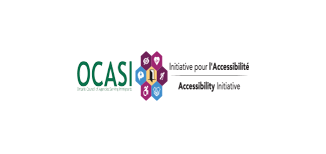
Please note that the full Accessibility Initiative logo consists of 2 elements horizontally aligned:
- the OCASI logo in colour (OCASI green)
- the Accessibility Initiative bilingual logo (AI logo), which includes an illustrated symbol and the name of the program “Initiative pour l’Accessibilité” in French and “Accessibility Initiative” in English underneath, horizontally aligned
2. Download logo
The Accessibility Initiative logo will be used with funders, partners, editorial, and promotional work, including e-learning materials.
You can download the Accessibility Initiative logo from its download section under assets, including low and high resolution files.
3. Colours
For your print and web projects, the Accessibility Initiative colour palette consists of one primary core hue (dark pink) and 3 accent solid colours (darker pink, blue, and yellow). The main colour usage is dark pink combined with very light backgrounds (based on accent colours) and darker gray for text.
Download colour schemes (.txt, .json)
Check accessibility contrast grid
Main colours
Primary dark pink
HEX: #9F2571 | CMYK: 39 / 99 / 26 / 4
Sample usage: dark pink backgrounds (footers, aside blocks, covers), coloured headlines, icons, links
Darker pink
HEX: #6F2058 | CMYK: 3 / 21 / 60 / 0
Sample usage: dark backgrounds, dark accents
Accent blue
HEX: #438FCD | CMYK: 72 / 34 / 0 / 0
Sample usage: accents
Accent yellow
HEX: #F5C97B | CMYK: 3 / 21 / 60 / 0
Sample usage: light accents
4. Co-branding
Co-branding shows a partnership between your program/project/organization and another organization and represents an exchange of credibility between brands.
Display the Accessibility Initiative logo next to other logos in horizontal or vertical orientation.
- Make all logos appear visually equivalent
- Add visually consistent spacing around the logos
- Use the logos on white or very light backgrounds
2 or more equal logos
Accessibility Initiative logo + Partner logo(s)
This option works for 2 or more equal logos:
- Horizontal lock-up: place Accessibility Initiative logo next to a brand partner logo.
- Stacked lock-up: place Accessibility Initiative logo above a brand partner logo.
- Separator: add a thin grey line in between the Accessibility Initiative logo and the brand partner logo.
Logo wall
Co-branding works best with 2 equal partners. If more than 3 parties are involved or if the relationship among them is not equal, try using another treatment instead, like a logo wall.
5. Logo usage
The logo on background colours
Do
Do
Do
Do
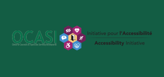
Don’t
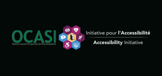
Don’t
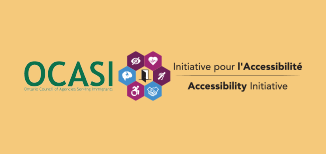
Don’t
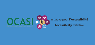
Don’t
The colour of the Accessibility Initiative logo is always:
- coloured, used on white or very light grey backgrounds
- black, used on white or very light backgrounds
- white, used on black, darker purple, or dark grey backgrounds
Whenever possible, work with the full Accessibility Initiative coloured logo version on white backgrounds.
The logo on graphical backgrounds
There will be instances where a graphical background or photograph may be used. For example, a poster or video where the canvas or screen is fully occupied by a photograph. Under such scenarios:
- Make sure the logo has enough contrast with the background
- Do not use the coloured Accessibility Initiative logo on top of a photograph, graphic, or gradient background unless it sits on a very light or very dark area of the image
Clear space
To provide appropriate visibility and legibility to your logo:
- keep a minimum clear space between the logo and other elements around
- use the height of the logo as a guide to determine a minimum clear space
- ideally, you may always leave more than the minimum clear space
Minimum size
Whenever possible, the size of the logo should be larger than the minimum size.
- for print materials, the minimum size is 1.25 cm (about 1/2 in) in height
- on digital screens, the minimum size is 40 pixels in height
🤔 🤔 🤔
As a rule of thumb, do not scale the logo to a point where it does not look good or has poor legibility.
Resizing proportionally
Don’t
Don’t
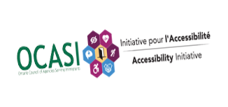
The proportions of the brand logo should never be altered:
- avoid stretching or narrowing the brand logo
- keep the same proportions (image aspect ratio) when the brand logo is resized
🤔 🤔 🤔
There are some keyboard shortcuts to resize the logo depending on the software you are working with. You can try to hold down the shift key when scaling the image to maintain the correct proportions.
Positioning
Only use your logo in one location per layout, print or digital page or other materials (PDFs, social media posts materials, banners).
Place your logo on the top-left of your layout as a standard practice since it is easier to remember by users:
- bottom-left, top-centred, or bottom-centred placements could work in some cases (i.e., footers, newsletters, covers, videos), better ask your designer
- avoid right-logo placements
6. Symbol
Do

Don’t
Accessibility Initiative visual identity does have a representative symbol also included in the logo.
The Accessibility Initiative symbol may be used on badges and social media profiles and it contains an illustration of 3 hands holding a candle, a sign with the legend “Support Survivors”, and a rose.
- The base of the illustration is a circle
- The symbol is always coloured
7. Typography
For your Accessibility Initiative designs, use the OCASI brand font. You can:
8. Icons
The purpose of the icons used on different materials and UI should be informative and used to drive the eyes of your audience to specific areas of interest.
Small icons
- small icons are glyph icons small in size
- use icons that are very simple and recognizable
- solid style is preferred when possible
- use for lists
- use as a user interface element on menus or small areas
As for website icons, see the web application icons section in the Bootstrap Framework guide.
Large Icons
- large icons should be straight forward
- large icons have 2 levels of detail (background and main icon)
- use large icons to highlight subsections without too much content, or on banners and callouts
